
Pantone has revealed the colors of 2016: Rose Quartz and Serenity!

See more here from Pantone.
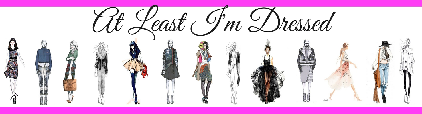
There are so many flattering ways to make this years colors work for you. Gorgeous women from all over the world rock these shades with incredible flair. Need some inspiration? Take a glance at the way these lovely ladies have worked Rose Quartz and Serenity into their wardrobes.


Chasing down specific colors on such a regular schedule can be a budget-destroying mission, but it doesn't have to be. This year's colors are going to pop up in lots of places, from apparel to accessories, even makeup! The popularity of pastels in recent years as ensured that there are many, many affordable pieces in this year's colors that you can scoop up for way below retail - check these out!


Shop HERE!!

Shop HERE!!

Shop HERE

Shop HERE!!

Shop HERE!!

shop HERE!

Shop HERE!!

Shop HERE!
I don't know about the colors just yet... but I'm not known for my fashion forwardness ;) I hated on the skinny jean trend at first, but now over half my jeans are skinny!
ReplyDeleteAnd as soon as all of your jeans are skinny, flares will be back in action!! ;)
DeleteHmm...those are pretty colors, but probably not good with my coloring and complexion. But very pretty. Also...I have to ask the dumb question, because I don't know: what exactly is pantone?
ReplyDeleteI feel the same way, Becky! I usually need some jewel tones in my life to not look washed out, but I went for it with the blue tulle skirt and liked it a lot. Don't be scared! And to answer your question, Pantone is a company that makes a system for standardizing colors, so manufacturers from across the globe can create the same or matching colors without really coming in contact.
Delete